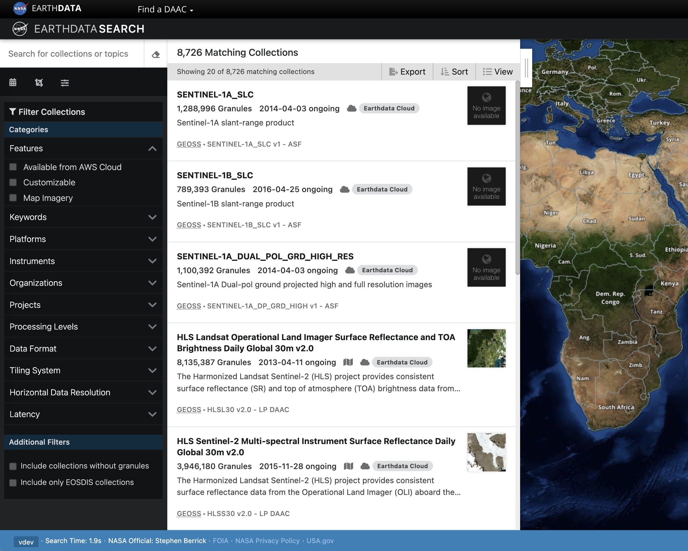
Experiments relating to optimizing the design/layout of elements in the Collection Search Results. The intent of this experiment is to see how the content visible within a search result will affect data access completions.
Hypothesis
By improving the display of the collection search results, users will more effectively find their desired collection and will access data more efficiently.
Variants
| Name | Original | Minimal | Thumbnail Only | Description Only |
|---|---|---|---|---|
| Description | Includes both the thumbnail and the description. | Thumbnails and descriptions are removed from the panel, in favor of displaying them in a panel, displayed when the user hovers a search result. | The description is removed and the thumbnail is visible. | The thumbnail is removed and the description is visible. |
| Screenshot |
Results
| Total Sessions | 22,451 |
|---|---|
| Start Date |
|
| End Date |
| Results | Takeaways | |
|---|---|---|
| Data Access Completion (Goal 4) |
Thumb Only held up well against the Original variant, which displays both a thumbnail and description. | |
| 5 minute plus session (Goal 1) |
The Original Variant appeared to consistently lead to longer sessions when compared to the other variants. | |
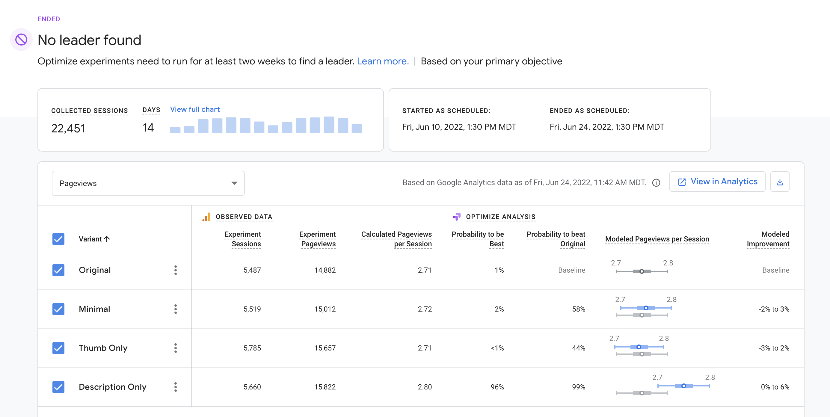
| Pageviews |
In the context of this test, we see an increase in page views as a negative. Our hope would be that a variant leads to the quicker discovery of the desired data product, and therefore a decreased page count. |
Summary
One interesting takeaway is that the Thumb Only variant appeared to perform best or nearly best in terms of increased data access and limiting pageviews and session length. It is an interesting finding and deserves a little more digging. A confirmation test will be run to see if we can replicate the result when comparing the Original and Thumb Only variants.
Actions
- Run a confirmation test with the Original and Thumbnail Only variants Trevor Lang


