A retest of two variations from the Collection Search Results Layout. The first run of the test showed promise for the Thumbnail Only variant and warranted a retest vs. the Original variant.
Hypothesis
By improving the display of the collection search results, users will more effectively find their desired collection and will access data more efficiently.
Variants
| Name | Original | Thumbnail Only |
|---|---|---|
| Description | Includes both the thumbnail and the description. | The description is removed and the thumbnail is visible. |
| Screenshot |
|
|

Results
| Total Sessions | 21,115 |
|---|---|
| Start Date |
|
| End Date |
| Results | Takeaways | |
|---|---|---|
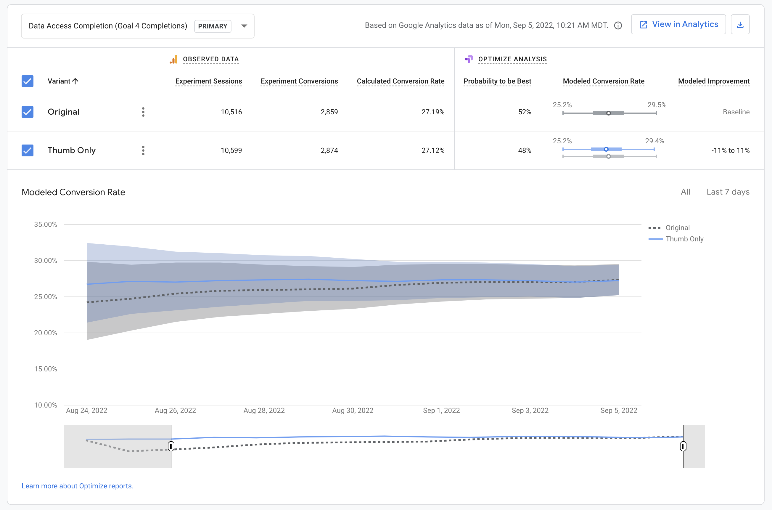
| Data Access Completion (Goal 4) |
|
Thumb Only held up well against the Original variant, which displays both a thumbnail and description. |
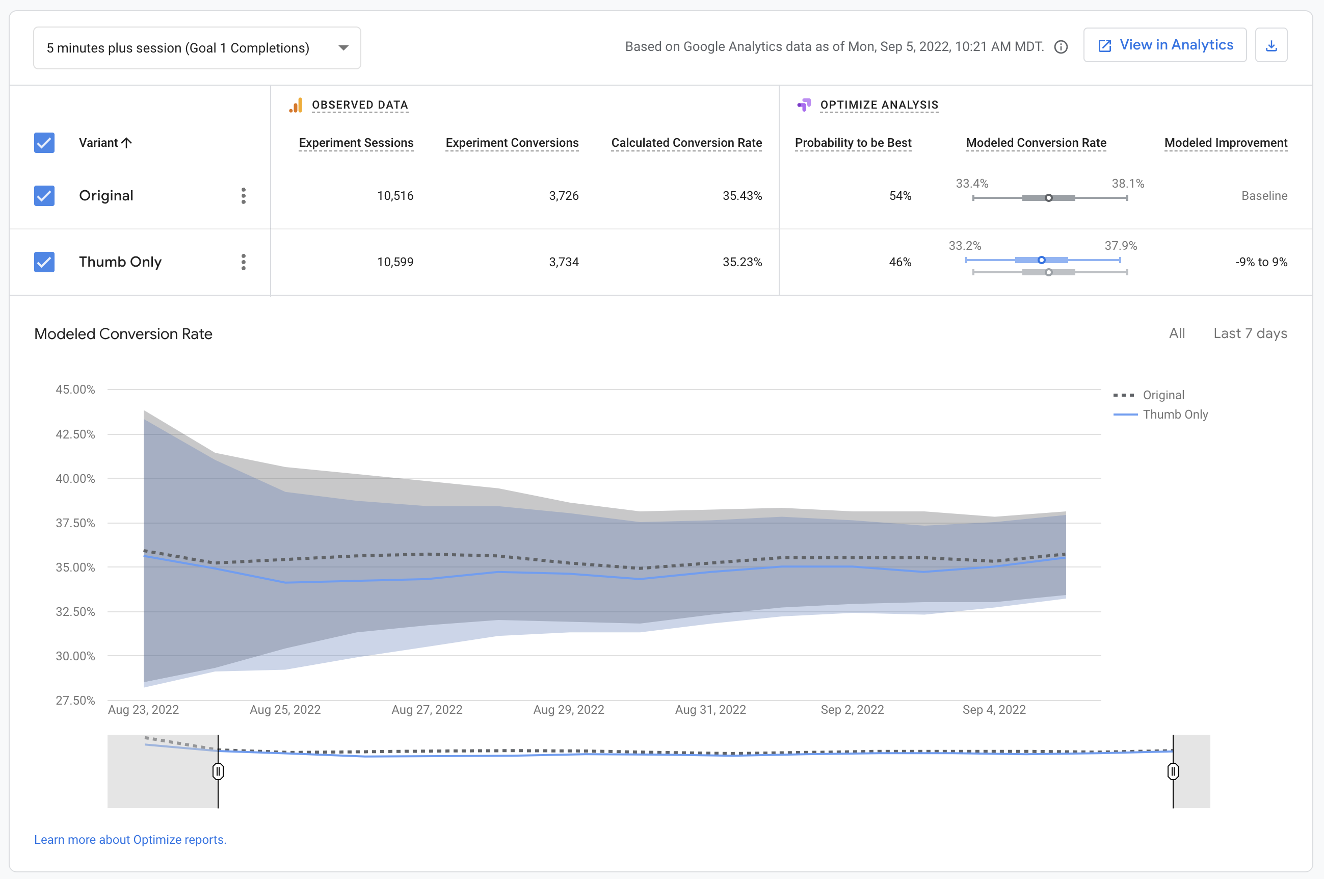
| 5 minute plus session (Goal 1) |
|
The Original Variant appeared to consistently lead to longer sessions when compared to the other variants. |
| Pageviews |
|
In the context of this test, we see an increase in page views as a negative. Our hope would be that a variant leads to the quicker discovery of the desired data product, and therefore a decreased page count. |

Summary
This test appears to show that data access completions are more likely when a description is included in the search results. When a description is included, both pageviews and 5 minute sessions increase, which may simply mean that users are browsing a little more and are eventually to complete data access.
Actions
Overview
Content Tools