Page History
...
We’re currently using the following viewport meta tag:
<meta name="viewport" content="width=1280,user-scalable=no">
This tag will trick the users browser to displaying at a width of 1280px and then scale the UI accordingly.
In order to create predictable responsive behaviourbehavior, we should use the more standard option, setting the content attribute to “width=device-width, initial-scale=1”
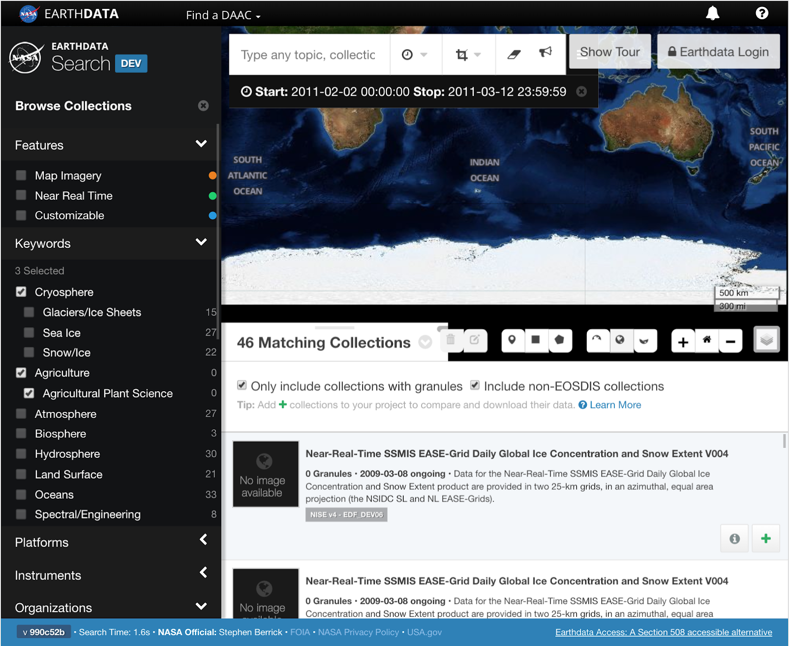
Search
- Sidebar width restricting map and granule sections
Adjusting the width of the sidebar would allow an increase in size in both the map and granule sections. This would also allow for greater room to adjust the sizing of both the Log in/Account actions in the upper right, as well as the map actions in the lower right. The sidebar likely can’t be condensed all that much due to the content contained, but any amount would help significantly in creating extra room in the other sections.
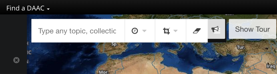
Logged out account actions section overlapping map toolbar
At the minimum screen resolution these two sections begin to overlap. This could be handled in multiple ways.Find an applicable icon to represent the Show Tour button, similar to the Feedback button.
Remove the “Earthdata” from the Earthdata Login at smaller screen sizes. Seems like Earthdata is somewhat implied.
Bring the Feedback and Show Tour buttons below the Log in button
- Wide layout for map toolbar
The width of the map toolbar causes it to take up a significant horizontal width.Move the non-search actions below the search bar
Shift the items in the toolbar to be listed vertically
- Map actions with layers options expanded
When the layers section is expanded, the entire actions toolbar is shifted to the left to accommodate the list. This leaves the granule count tab covered up
Open the panel above the toolbar so the preceding items are not shiftedOpen the panel above the toolbar so the preceding items are not shifted
Shift the items in the toolbar to be listed vertically


...
Overview
Content Tools